A new look and tone that’s as fresh as the brand is itself
INDUSTRY:
CPG
THE ASK:
Visual Identity, Verbal Identity, Motion
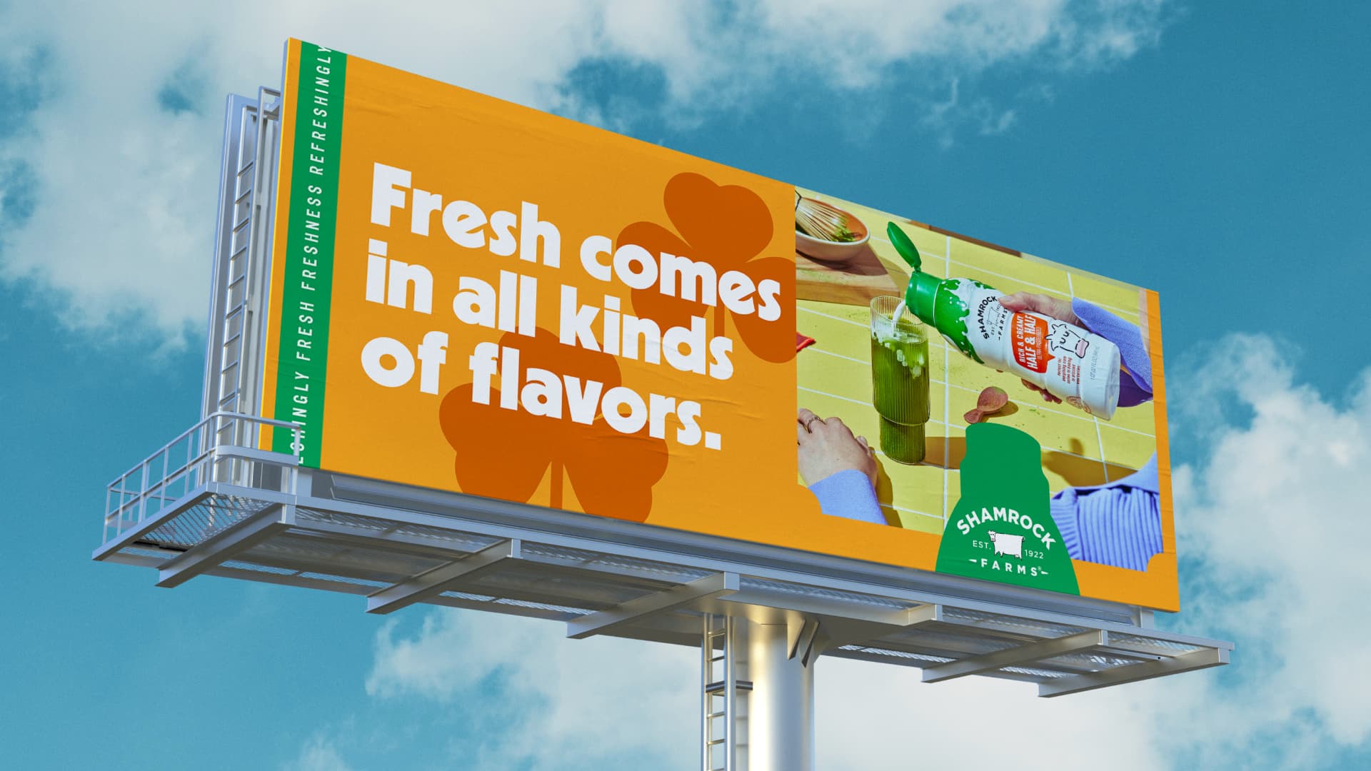
In a monotonous category like dairy, Shamrock Farms needed a way to be different. Or better yet, fresh. Actually, fresher than fresh. So, we redesigned everything and took on a whole new tone of voice. In short, we became Refreshingly Fresh.
How We Kept Things Refreshingly Fresh
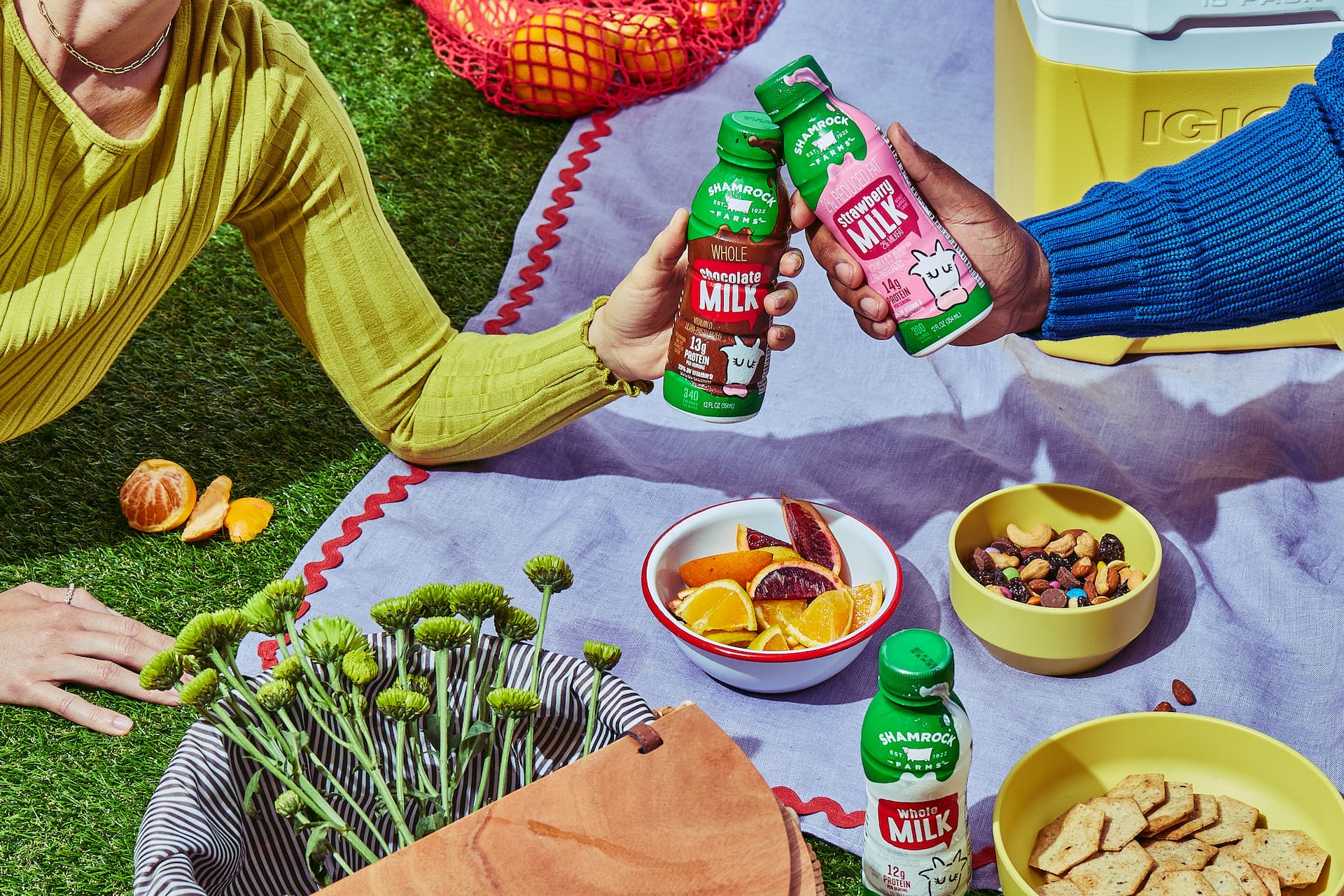
Shamrock Farms is a dairy brand from the desert. Not quite what you think of when you hear the word “fresh.” But guess what? That’s exactly who they are. With milk that goes from farm to fridge in two days and flavors like Cookies ‘N Cream and Birthday Cake, they’re all about being refreshingly fresh. They just needed a design system to match.
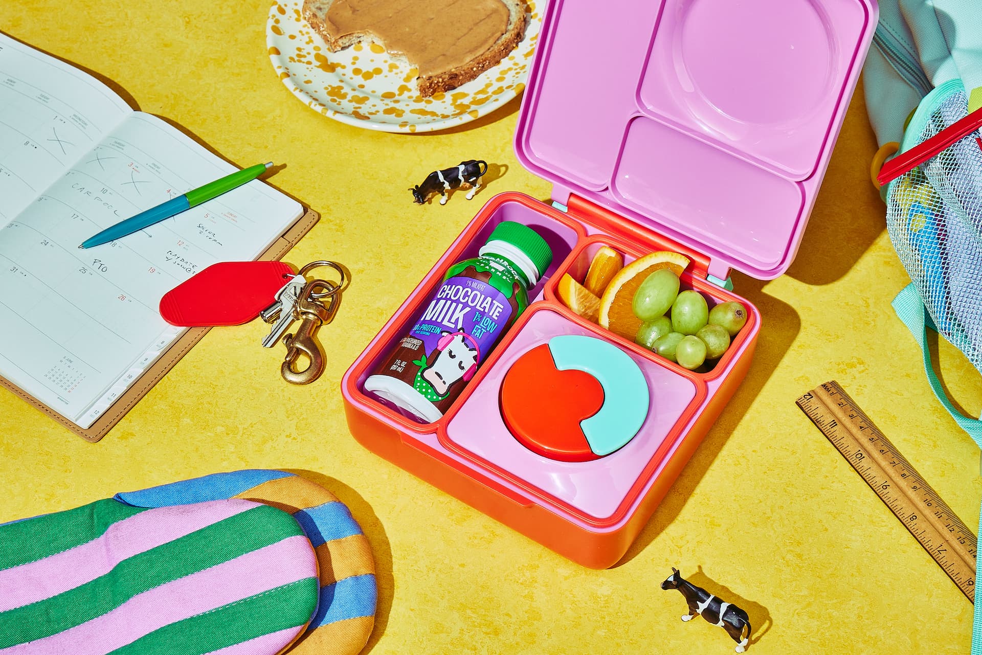
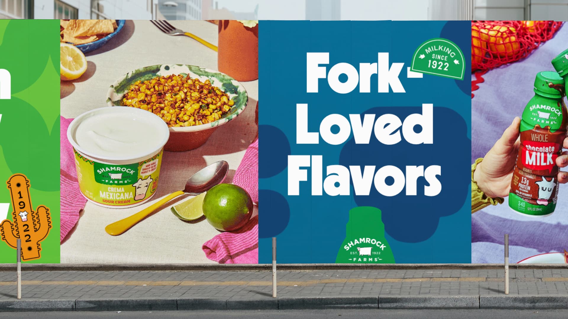
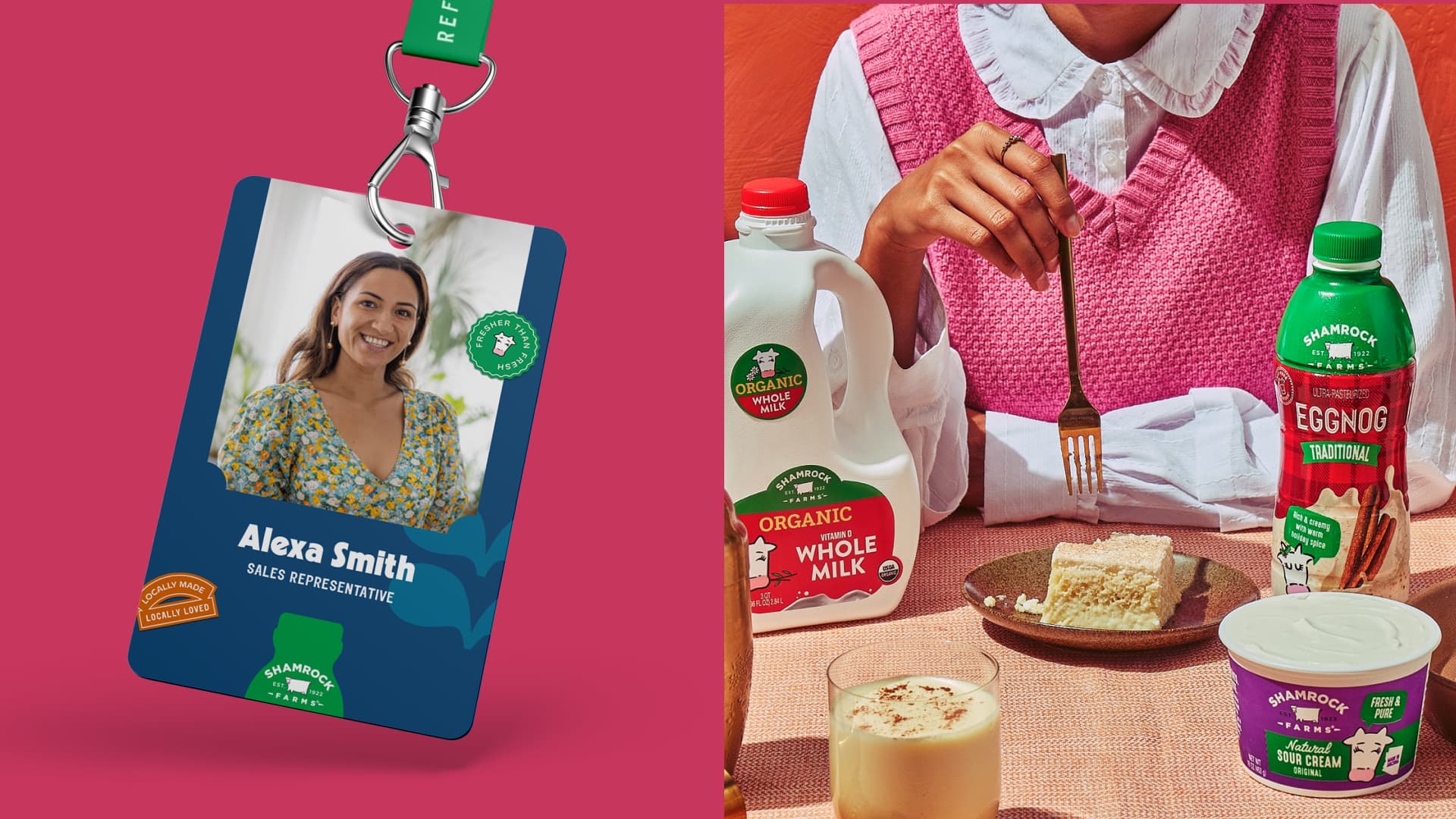
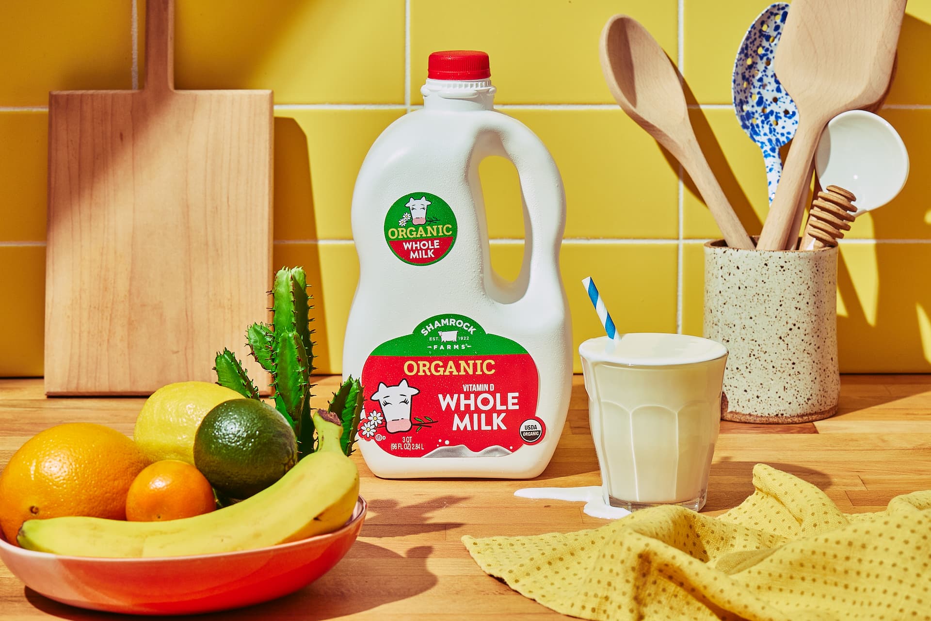
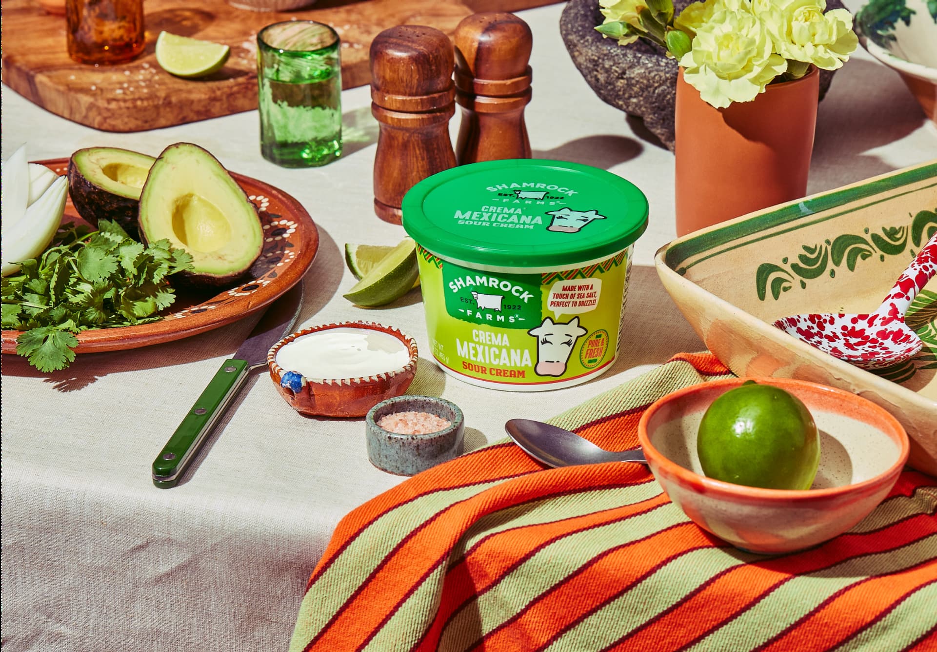
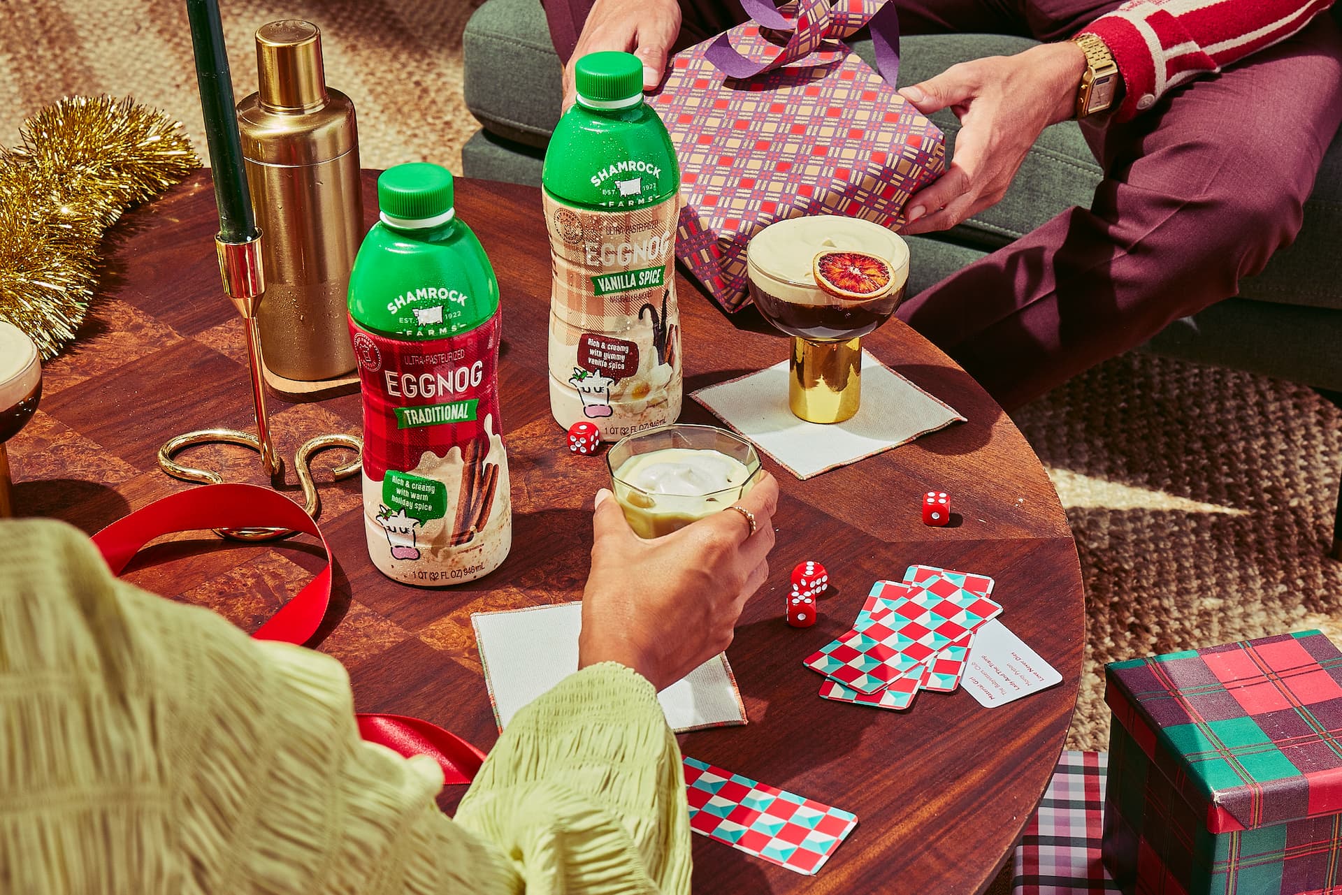
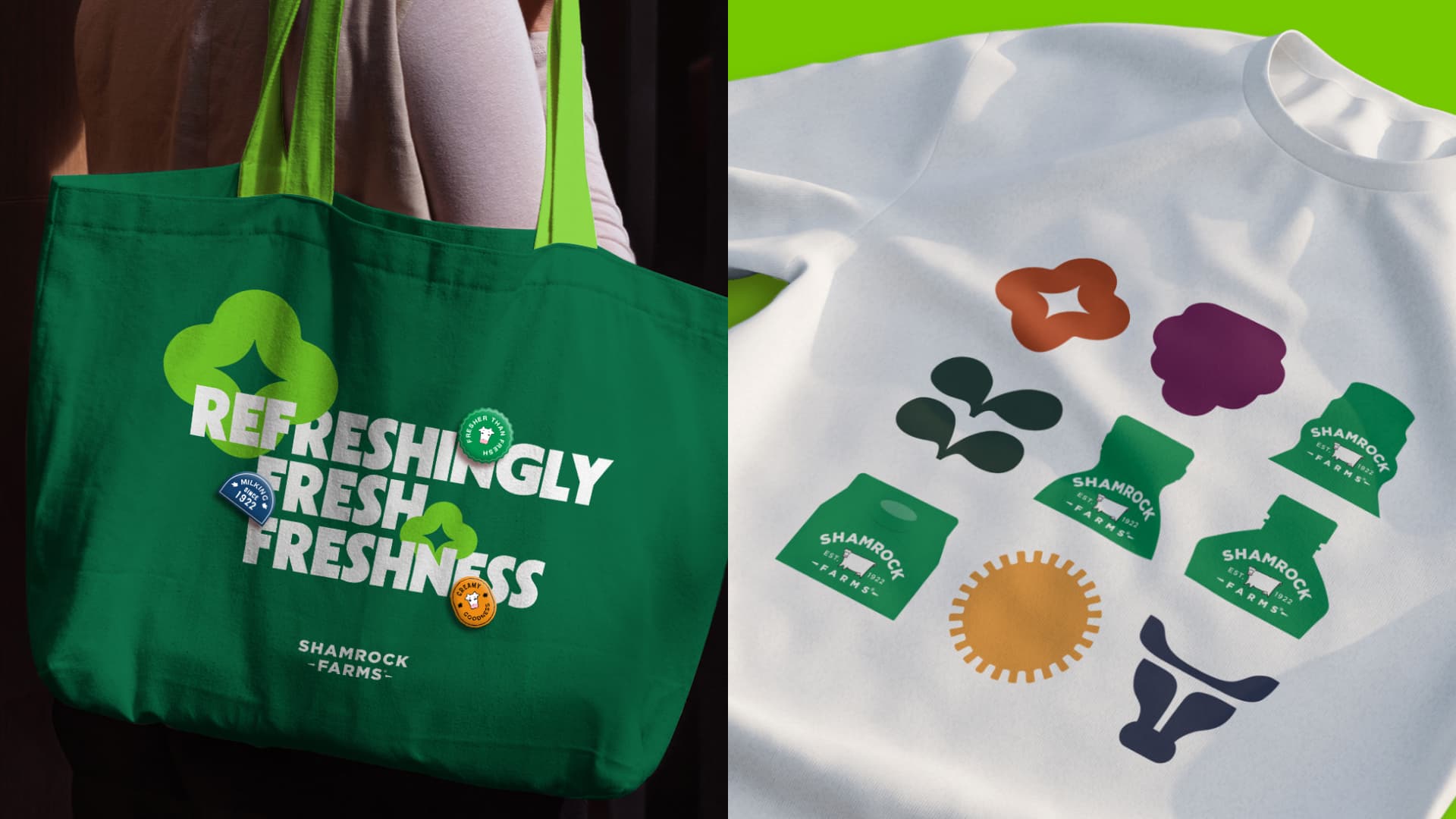
We started with their iconic green tops. From milk to sour cream, everything Shamrock Farms sells in the store has a green top. That meant all their advertising should, too. Every product got a carefully crafted logo to match.
Then we looked to the Shamrock heritage and designed pattens to reflect it. Things like desert wildflowers and clovers allowed us to lean into both their Arizona and Irish backgrounds.
Seals of freshness helped us bring in personality and were a great tool in demonstrating how Shamrock Farms products elevate beverages and meals. While they’re never the hero of an ad, they’re a compelling co-star.
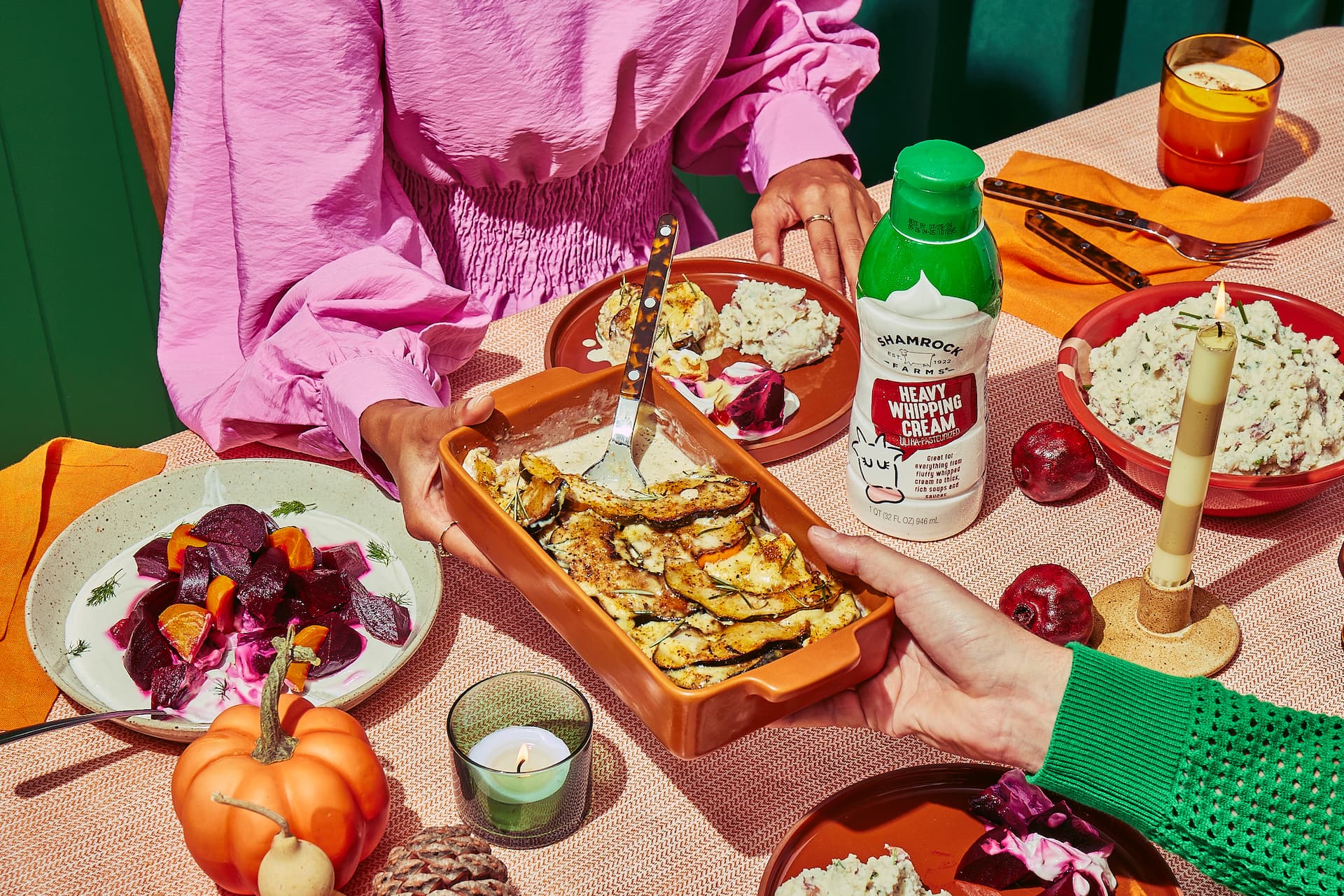
Most importantly, we took an entire new approach to photography. While most diary brands look to uninspired product shots, we know what really sells is the finished food and drink. Looks good, right?